How to Make a HomeKit Temperature Graph
Build a HomeKit temperature graph by recording sensor values with Apple Shortcuts and displaying them as a DataJot time series.
A HomeKit temperature graph is useful when a single sensor value is not enough. The current temperature tells you what is happening now. A graph shows how the room changed during the night, how fast it warmed up, and whether your heating schedule matches real conditions.
Apple Home does not provide a built-in long-term graph for most HomeKit temperature sensors. DataJot can create one by storing repeated readings from Apple Shortcuts.
What the Graph Needs
A useful temperature graph needs three things:
- a consistent source value;
- a regular recording schedule;
- a chart that keeps the historical points.
HomeKit provides the source value. Shortcuts provides the schedule. DataJot provides the chart.
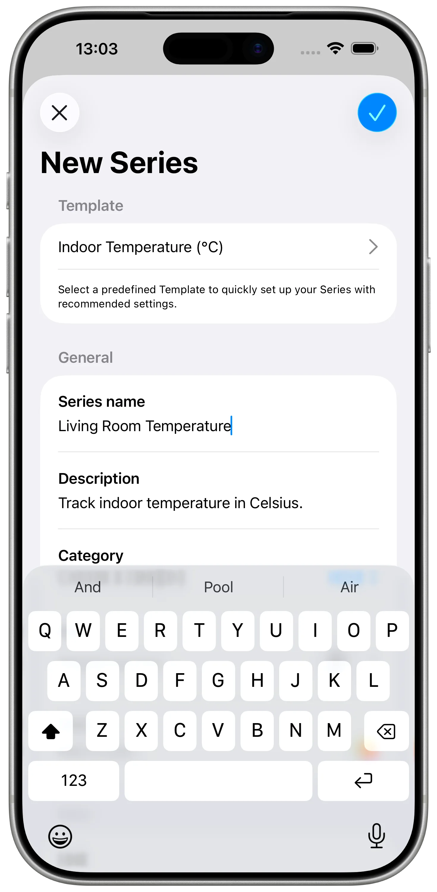
Step 1: Create the Chart Series
In DataJot, create a temperature series for the exact room or sensor you want to graph. Use the same source every time the Shortcut runs, so the graph represents one real place instead of a mix of readings.
Set the unit to Fahrenheit or Celsius, depending on how your HomeKit setup reports temperature.
The fastest path is to start from an Indoor Temperature or Outdoor Temperature template. If neither matches your setup, create a custom series and choose the unit and chart style manually.
Step 2: Record HomeKit Readings
Create an Apple Shortcut that reads the HomeKit temperature sensor and adds the value to the DataJot series.
Run the shortcut manually and check that a point appears in the chart. This first manual run confirms that:
- the correct sensor is selected;
- the value is numeric;
- the correct DataJot series is receiving the point.
If you need the detailed shortcut setup, follow the main guide: Track HomeKit Temperature History with Apple Shortcuts.
Step 3: Pick a Sampling Frequency
The graph will only be as useful as the points you record. For a room temperature graph, a reading every 30 or 60 minutes is usually enough to show heating cycles, overnight cooling, and morning recovery.
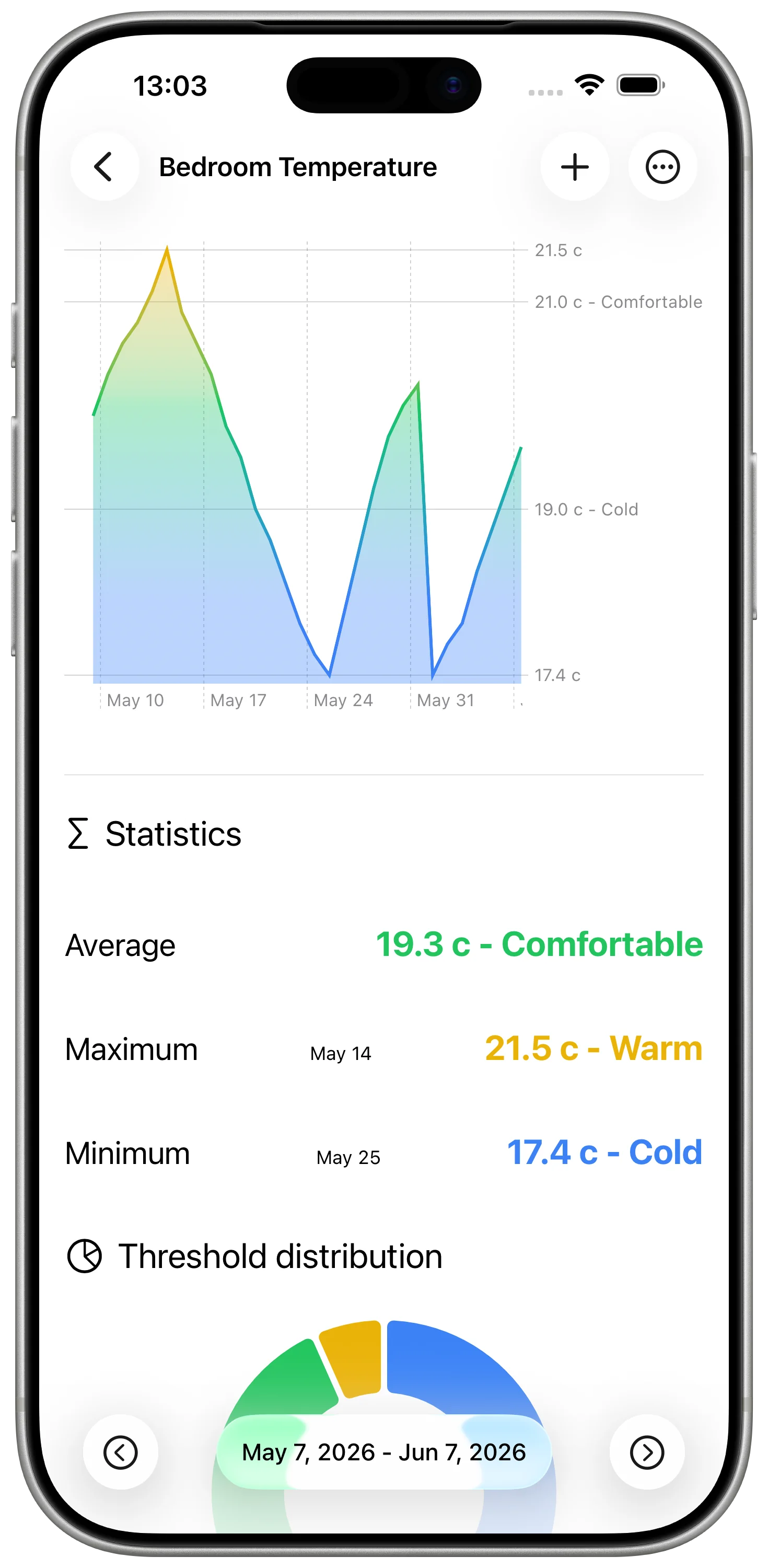
Step 4: Read the Graph
After the automation has run for a day or two, open the series in DataJot and look at the shape of the curve.
Common patterns:
- a smooth overnight decline;
- a sharp drop after a window opens;
- a morning rise when heating starts;
- a flat line when the room is stable;
- repeated daily cycles.
A HomeKit temperature graph is most useful when you compare behavior across days. One day can be misleading. A week usually tells a clearer story.
Related Home Data Ideas
Once temperature tracking works, you can use the same approach for:
- humidity in a bathroom or bedroom;
- indoor air quality;
- outdoor temperature;
- local weather observations.
For weather-specific tracking, see Track Local Weather Data in DataJot.
In Short
To make a HomeKit temperature graph, record HomeKit sensor values at regular intervals and store them in DataJot. The chart becomes useful after a few days, when trends and room patterns become visible.